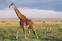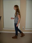
To create this image, I began with a picture of my house and sidewalk. Then, I took a full body picture of myself and selected the necessary areas. Next, I used refine edge to smooth and fix some of the selected areas, and I moved the picture of me on the the house image. Then, I worked on my shadow. I chose a giraffe to be my shadow (inner me), because I am short so the opposite would be that I am tall inside. I took the picture of the giraffe and selected the giraffe out of it, selected the inverse and changed it to Black & White in refine edge. I then used refine edge to try to smooth it out more and went back and changed some of the selected area until it was smoother. Next, I took the giraffe and put it onto my house and sidewalk picture. Then, I changed the opacity of it and used the move tool, transform tool, and warped it to position it how I wanted it. Then, I add text that said "Tall Inside" using the text tool. I think this was a cool project. The hardest part was getting the giraffe shadow to look and be positioned right. The easiest part was inserting the text.
Wednesday, January 30, 2013
Friday, January 25, 2013
Tattoo
http://www.youtube.com/watch?v=ll5dWnVfT2Y
To create this image, I first I found a picture of someone's feet. Then, I created butterfly shapes that would make up the tattoo design. I set it to soft light mode and placed the tattoo where I wanted it. Next, I created a displacement map and duplicated the image. I created a new layer, pressed shift-backspace and made it a neutral gray color. I switched to a blend mode of overlay and used the dodge tool to add highlights to the feet. I also duplicated that layer and switched to the burn tool to make areas darker. Then, I saved the displacement map, went back to the original image and brought up the tattoo. I converted to smart filters and made sure the tattoo was positioned where I wanted it. I went to Filter>Distort>Displace and tried different scale numbers and loaded the displacement map. Once I had the numbers that worked with the distortion best, I continued by using a layer mask to fix some pieces. I changed the mode to subtract and lowered the opacity. The hardest part of this tutorial was using the burn and dodge tools to add darkness and highlights because it was hard to tell where they should go. The easiest part was creating the butterflies that would make up the tattoo.
Tuesday, January 22, 2013
Combining Vectors with Photographs (Cranes)
First, I opened the top image and then chose Image>Canvas Size to make room for the second picture. Then in the layers panel, I reduced the opacity of the top layer and re-positioned it to make the pictures overlap. Next, I used the Rectangular Marquee tool to hide part of the top layer. Then, I chose Select>Inverse to invert the selection, added a layer mask and reset the opacity to 100%. I chose Image>Trim to eliminate the empty white canvas. I chose the Custom Shape tool and the flower shape and added some flowers along the seams of the image. Then, pressed Control, clicked on the Vector mask thumbnail, selected the middle layer and pressed Control-J. Then, I dragged Layer 2 to the top of the stack and turned off the visibility of the Shape layer. While on the top layer, I pressed Control and clicked on the Layer thumbnail. I took the Rectangular Marquee tool, clicked the Subtract from selection icon and put a rectangle above the seam around the shapes. I chose the inverse, added a layer mask, pressed Control and selected the Layer mask. Then, I selected the Multiple Crane Mask thumbnail and chose the inverse, set the default colors by pressing D and pressed Control-Backspace to show the top photo. I then added more flowers around the image and added one with a lower opacity to top right corner. I really liked the way the image turned out and think the techniques used to create it were very cool. The hardest part for me was getting the flowers to show through to the top background. The easiest thing was adding all the flowers around the perimeter at the end.
Displacement Map
I started by clicking on the channels palette and choosing the red channel. Then, I duplicated the channel. Next, I created a new document and added a .7 Gaussian blur by going to Filter>blur>Gaussian blur. Then, I saved this new document. Going back to the original image, I clicked on the "RGB", opened the layer palette and added text on a new layer. Then, I rasterized it by right clicking on the layer palette and choosing rasterize test. Then, I went to Filter>Distort>Displace. Next, I opened the image that I saved before. I chose overlay mode and duplicated the distorted layer. Then, I added a inner shadow and dropped the opacity of the second layer to 30%. The hardest part of the assignment was remembering how to add the inner shadow, and the easiest part was adding the text. I really liked the way the image turned out. I think this was a good tutorial.
Friday, January 18, 2013
Compositing with Silhouettes
First, I loaded the luminosity as a selection and created a new Alpha channel. I set the Fill dialogs to white and changed the blending mode to overlay. Then, I created a new layer, chose Load Selection and selected Alpha 1 to fill the area with black. Next, I worked on the room image. I created a new adjustiment layer and chose hue/saturation, turned on the colorize checkbox and set the hue, saturation, and lightness. I used the move tool to drag an image over to the room image that would add texture. I desaturated the color, changed the mode to overlay and created a merged copy of the image. Then, I used the move tool to merge this layer into the original image. I positioned it in and added a layer mask. I added a gradient and drew out several gradients. I used the horizontal type tool to add text. Then, I used the single row marquee to make to sections of pixels white around the words. I added the words at the top. I clicked on the room layer and added a hue/saturation adjustment layer and changed the options making some areas bluer. Then, I used the brush too to clean up some of the hairs. The hardest part was adding the room image to the silhouette. I had to try several times before getting it to work correctly. The easiest thing was doing all the finishing touches and adding the text at the end. I liked this tutorial, but it was not one of my favorites.
Wednesday, January 16, 2013
Montage
Vintage Tractor Photograph
To create this image, I used Photoshop. I first started with the background. I set a gradient to be the necessary colors for the background (browns). I also made it radial. I changed the texture of the background and added two textured photographs to contribute even more to it. I next used the rectangle marquee tool to create the white border around the picture, and I added a clouded effect to it. I also added noise, crosshatch, changed the hue/saturation, and a drop shadow. I added the tractor picture by using the marquee tool, free transform tool, and a couple combinations of buttons. I then changed the opacity of the picture, the distance, and the noise. A stroke with a pattern was also added. This pattern was used on the white border, too. I changed the hue/saturation. Next, I linked three layers and used the free transform tool to tilt the image. I copied the three Polaroid layers and did a layer merge. Then, I tilted the new copy of the image and changed its levels. I repeated these steps to create one more tilted copy. I am really enjoying Photoshop and liked this tutorial. I think the hardest part was getting the layer to merge correctly and creating the tilted copies. The easiest part for me was setting up the background.
http://www.myinkblog.com/create-a-vintage-polaroid-effect/
Thursday, January 10, 2013
Refine Edges Project
To change this image, I used the quick selection tool to select the dog. Then, I went into the refine edge options, chose the white background option, made the radius appear, and selected smart radius. I used the refine radius tool to paint over some of the areas to pick up the edges better. I also used the eraser tool to help, too. I changed the saturation on the background by inversing the selected area and clicking the hue/saturation button. Then, slid the saturation bar. This made the dog stand out more. The hardest part of the project was being detailed with it because the image was small. The easiest thing was changing the saturation of the background colors.
Wednesday, January 9, 2013
Veggie man
This is the image of the veggie man I created using Photoshop. I began with separate images of different veggies and ended with an image fill with them all. To start, I used the elliptical marquee tool to select the blueberry. Then, I used the move tool to position the blueberry inside of the carrot slice. This created an eye for the veggie man. I used the elliptical marquee tool to select the eye and then clicked the move tool. I held down Alt and moved the eye to the left side of the head. I dragged a copy of the eye to the right side of the head using Shift+Alt. I used the elliptical marquee tool to select the kiwi and dragged it to the melon to be the mouth. I selected the magic wand tool and clicked inside the pear tomato. Then, I selected all the parts of the pear tomato. Then, I held down control and dragged the tomato nose onto the face. I used the lasso tool to make selections around the bow tie pasta. I free handed some of it and held down Alt to create straight lines for other parts. Then, I added the bow tie to the melon. I used the lasso tool again to create a rough outline around the mushroom. Then used the Shift and Alt buttons to add and subtract pieces to get a better outline of the mushroom. With the magnetic lasso tool, I clicked the bottom left of the inside of a grapefruit and moved the mouse around the flesh to select this inside piece. I rotated and re-sized this piece to be the ear. Then, I duplicated it and reflected/transformed it. I selected the radish using the magic wand tool and Alt button. I moved it to the face and duplicated it and transformed it. Lastly, I cropped the face using the crop tool. The hardest part of this assignment was selecting the bow tie pasta with the lasso tool. The easiest part was doing the radishes because it was using one tool and just clicking.
Subscribe to:
Posts (Atom)