Tuesday, February 26, 2013

Vintage Poster

                                                        
Source images:


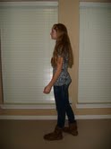
To create this image, I started with a old piece of paper background on a dark filled layer. Then, I went to Filter>Render>Clouds and took an large eraser tool to delete some of the cloud areas. I changed the mode to Color Burn and the opacity to 75%. I took the image of myself and placed it in the image. Next, I added a layer mask>reveal all. I placed the cougar head on my body and positioned it. I put the layers holding the images on me and the cougar head in a new folder, and converted the folder into a new Smart Object. I then selected this smart object and placed some guide lines in the middle of the design. Then, I duplicated the smart object, applied a Motion Blur angle of 0 degrees, a Distance of 50px, and placed the layer below the original. I changed the original layer to color burn, and set the opacity to 25%. Then, set the layer's blending mode to hard light and moved the "clouds" layer above all the layers in the layer's palette. Next, I placed a Sunburst shape in the design, rasterized the shape, change the mode to overlay and set the opacity to 75%. I Ctrl-clicked the layer with me in it, selected the "Sunburst" layer and deleted the selection. I applied a Layer Mask>Reveal All to the "Sunburst" layer. Then, I drew some random splatters with different brushes. I gave the layer with me in it a drop shadow. I took a wallpaper image and saved it as a pattern. Then, I went into the design and added a rectangle filled with the pattern and desatured some of the areas. Then, I added a Layer Mask> Hide All and added in some areas of the pattern. Then, I Ctrl-clicked the layer with me in it and clicked the texture layer and used the fill tool to fill the selection. I changed the mode to multiply. I did the same thing with a retro image. I selected the words out of the example imaged and put them on my image with a drop shadow. Then, I added some pieces of paper with a drop shadow. I used the brush tool to shape them. I added my last name in different typefaces in the paper. Lastly, I added the words "Tuts" using the text tool, changed the mode to overlay and duplicated its layer. The hardest part of the project was adding in the retro image and the easiest part was adding the text. I think this project was really neat and I like the way it turned out.


Wednesday, February 20, 2013

Contrast Project


http://www.youtube.com/watch?v=R65wpwcS1os
Link to Text Tutorial: http://www.adobetutorialz.com/articles/53/1/Gel-Text


I used the same steps to edit the Taylor Swift picture as I used with the grunge picture. I did lower the opacity in some steps because her skin is very light. I also, applied most of the effects to her hair since it is a large textured area. To start, I duplicated the original picture layer. I changed that duplicate layer to screen mode and then held down the Alt key and pressed the masked icon. I changed the opacity to 30% and painted with white on the eyes to show the screen layer. Then, I did a stamp copy of this, changed mode to hard light, and desaturated the colors by pressing Shift>Ctrl>U. I added a mask, and painted in black with about 30% opacity on some of the highlight areas. Again, I did a stamp copy layer, then added a high pass effect, and changed the mode to hard light. Next, I pressed Alt and clicked on mask icon. Using a white brush and a 50 % opacity, I painted on the textured areas. Again, I made a stamp copy, selected multiply mode, and created a white mask, and painted with black at 30% to bring back some of the underneath layers in the face. Then, I added a desaturated stamp copy, changed to hard light, Alt clicked on the mask layer button, and painted over sharped areas. I clicked on the brightness/contrast button and pressed Alt>Ctrl>Invert. Then, I painted with white all around on the background to bring more focus on the face. I changed it to black and white and changed some of the settings. I used the brightness/contrast button again to brighten the portrait up. I then inverted it and painted with a soft brush. Another stamp copy was used, I went to Filter>Blur>Gaussian Blur, changed the settings a little and added that effect. I put a mask on and changed the blend mode to soft light. Following that, I painted some of the middle of the face with a soft, black brush at 60%. I added a new layer and selected an orange color. I filled the layer with the selected orange by pushing Alt>Backspace, changed the mode to color, and brought the opacity down. I added a stamp copy layer, then went to Filter>Other>High Pass and changed the mode to hard light. I then Alt clicked on the mask layer button to bring up a black filled mask. Finally, I painted the textured areas with white. I liked this tutorial. The hardest part was figuring out how to do the invert. On the other hand, the easiest part was making all the stamp copies, because it was an easy key combination. In addition, it was a repeated step so it was easy to learn and remember.
To create text, I first began  by using the text tool to type "Taylor Swift" in black letters. I then selected a typeface. I added many effects to the text. These include a drop shadow, inner shadow, outer glow, inner glow, bevel and emboss, contour, and color overlay. I went through each of these effects and changed the settings. These effects give the text a gel look. I chose to make the text red because it goes nicely with the black and white picture. Also, her most recent album is red. I really liked this text tutorial.

Saturday, February 16, 2013

Grunge


http://www.youtube.com/watch?v=R65wpwcS1os

To start, I duplicated the original picture layer. I changed that duplicate layer to screen mode and then held down the Alt key and pressed the masked icon. I changed the opacity to 30% and painted with white on the eyes to show the screen layer. Then, I did a stamp copy of this, changed mode to hard light, and desaturated the colors by pressing Shift>Ctrl>U. I added a mask, and painted in black with about 30% opacity on some of the highlight areas. Again, I did a stamp copy layer, then added a high pass effect, and changed the mode to hard light. Next, I pressed Alt and clicked on mask icon. Using a white brush and a 50 % opacity, I painted on the textured areas. Again, I made a stamp copy, selected multiply mode, and created a white mask, and painted with black at 30% to bring back some of the underneath layers in the face. Then, I added a desaturated stamp copy, changed to hard light, Alt clicked on the mask layer button, and painted over sharped areas. I clicked on the brightness/contrast button and pressed Alt>Ctrl>Invert. Then, I painted with white all around on the background to bring more focus on the face. I changed it to black and white and changed some of the settings. I used the brightness/contrast button again to brighten the portrait up. I then inverted it and painted with a soft brush. Another stamp copy was used, I went to Filter>Blur>Gaussian Blur, changed the settings a little and added that effect. I put a mask on and changed the blend mode to soft light. Following that, I painted some of the middle of the face with a soft, black brush at 60%. I added a new layer and selected an orange color. I filled the layer with the selected orange by pushing Alt>Backspace, changed the mode to color, and brought the opacity down. I added a stamp copy layer, then went to Filter>Other>High Pass and changed the mode to hard light. I then Alt clicked on the mask layer button to bring up a black filled mask. Finally, I painted the textured areas with white. I liked this tutorial. The hardest part was figuring out how to do the invert. On the other hand, the easiest part was making all the stamp copies, because it was an easy key combination. In addition, it was a repeated step so it was easy to learn and remember.

Thursday, February 14, 2013

iPod

To create this image, I started with a picture of myself in a dance/jumping pose. I selected myself in the picture and created a solid adjustment layer. I used a soft brush to smooth out the edges of the silhouette. Next, I created a color adjustment layer and chose a light blue for the background. I held control and clicked on the layer mask of the color adjustment layer. Then, I created a new layer and selected the default colors to fill the layer with black. I used the transform tool to move the shadow into position. I added a layer mask to the shadow layer and used the gradient tool to add a gradient to it. I took a picture of an iPod from the Internet and used the selection tool to take it out of its original image and move it into my hand. I created a thumb using the brush tool. Then, I created the headphones using the pen tool and the brush tool. I added a gradient overlay to the silhouette and inserted text with effects. Some of the effects on the text include stroke, bevel and emboss, and colorize. I really enjoyed this tutorial and think it was super fun. I liked that I have a picture of me similar to the popular iPod images. The hardest part was getting the gradient added to the shadow to work. In contrast, the easiest thing to complete was  painting on the brush added to the background.

Wednesday, February 13, 2013

High Pass


To change this image, I first made a copy (Layer 1) of the original image shown at the top. Then, I went to Filter>Other>High Pass and changed the radius to about 33. Next, I changed the blend mode of the layer to hard light. I copied layer 1 and then copied that layer to add more contrast to the image. Next, I lowered the opacity of the new layer. I created a new layer filled with a 50% gray and with a mode of hard light. I then went to Filter>Noise>Add Noise. I set the Distribution option to Gaussian, checked the Monochromatic option, and set the amount of noise to about 4%. I added an adjustment layer and lowered its saturation to 40%. I liked this tutorial because it was a fun and quick way to change a picture up and make it a little more interesting. The hardest part was deciding how much to lower the saturation. The easiest part was duplicating the layers.

Thursday, February 7, 2013

Brushes Masterpiece

I used the Brush Tool to complete this whole picture. I first began with the grass. I chose a nice green and painted the grass area solid. Then, I took the brush that looks like grass and went over top of the previously colored area. This brush used dual tone, so I chose a darker and lighter green to compliment this function. I painted in the tree using a more typical brush and then went over it using a texture brush to give the effect of bark and to show that the tree is not smooth. Next, I lowered the opacity and created clouds. Then, I changed the mode to behind and used a light blue to add in the sky. I used a leaf brush, changed the scattering effect, the purity effect, and painted in the leaves of the tree. I used some of the special loaded brushes such as the flowers and the butterfly to add more to the image. I really enjoyed this assignment and how it was very free. The easiest part was adding in the clouds and the sky because the clouds were simple to create and the sky was just a solid color. The hardest part was adding the texture to the tree because it took a while to get it how I wanted it to look. It was also time consuming.

Text of Choice


http://www.adobetutorialz.com/categories/Adobe-Photoshop/Text-Effects/page/3

I begin by typing "VICTORIA" on a new document. Then, I added a gradient overlay and bevel and emboss to the text. Next, I went to Layer>Layer Style>Create Layers. I then merged all the text layers. From the Filter menu, I went to artistic then chose the plastic wrap effect. I then applied this effect again by pressing Control+F. I pressed Control + U to pull up the hue/saturation window and I changed the color to a blue. Next, I changed the bevel and emboss settings and added a stroke. Lastly, I duplicated the layer and changed the layer mode to color dodge. I really like this tutorial and I think it was fun. The hardest part was applying the plastic wrap effect. The easiest part was typing the text. 

Tuesday, February 5, 2013

Text Transformation

http://www.adobetutorialz.com/articles/30970034/1/photoshopping-aqua-wallpaper/2

I first started by creating a new document and filling the background with a blue color. I then used the brush tool to paint a darker blue around the edges of the document. Next, I took the Horizontal Type tool and typed my name. Then, I changed the parameters of the text. I positioned the letters and copied them in a darker blue to put as a shadow underneath. I added an outer glow to the darker letters. Then, I added an inner shadow, inner glow, outer glow, and gradient overlay to the top letters. Next, I added a satin effect to the last letter. I created a new layer and added a shadow behind the letters using the Brush Tool. I then created an ellipse, changed its parameter, and gave it an inner shadow. An ellipse like this was added to each letter. Lastly, I created bubbles by using two ellipses. One ellipse had an inner shadow and the other had a gradient overlay. Both of the shape's layer have an opacity at 0%. I then copied the bubbles, positioned them, and used the transform tool to size them. I really like the way the text came out. I think this was a fun tutorial. The hardest part was getting the bubbles to work the way I wanted them to. The easiest part was setting up the background.